

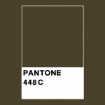
We’ve all been faced with the question: “What’s your favorite color?”. Many of us are so used to this question that we answer it without much thought. So what is your least favorite color? What would be your answer to the question? The name of this ugly color according to the majority: Pantone 448C. Its more casual name is “dark grayish olive”. Ok, we found the ugliest color. What will this do for us?
The Effect of Colors on Psychology
There is a rule known to artists, scientists, and especially advertisers working with color. Colors are closely related to emotions. The blue color is often associated with calmness and relaxation. Red reminds us of concepts such as danger and love. Green is peace and health. In the coming days, we will have an article about how colors affect the chemistry of our brains. But right now, the subject of this article is a little different.

Changing the Color of Cigarette Packs
In 2012 the Australian government wanted to go for a new design on cigarette packs. Thus, uniform packages would be made instead of interesting packages that would push people to buy cigarettes. As a result, the sales of cigarettes who wore a more boring outfit would also drop, and people would be less poisoned. That was exactly the plan. But what color would we choose? It couldn’t be colorful. It was interesting. We could have done black, but it was also the favorite color of many. What would we do? It’s almost impossible to find a favorite color or the most hated color that everyone agrees with. But in such cases, taking the opinion of the majority leads us to the most accurate conclusion possible.
As a result of a three-month study by researchers at GFK company on more than 1000 smokers, it was revealed that Pantone 448C was the most disliked color. Some of the participants associated this color with “dirt”, while others said it directly suggested “death”. This color would be the right choice to use on cigarette packs.

Since 2016, this ugly color has been used on cigarette packaging in many countries, including France, the United Kingdom, Ireland, Israel, Norway, New Zealand, Slovenia, Saudi Arabia, Uruguay, Thailand, Turkey, Belgium, and the Netherlands. In fact, disturbing images such as “man in the morgue, rotten teeth, pitch black liver and dead baby” are placed on the packages to further reduce interest.
Did Ugly Cigarette Packs Reduce Sales?
Super, we found people’s least favorite color for cigarette clothes. Now let’s look at the results of this to see if it really worked. According to the results of Bonfrer’s research in Australia in 2019, cigarette sales fell by 7.5% after the last color adjustment. The fact that we observe such a serious drop rate by simply changing the color is a good example of how colors affect our psychology. This color arrangement on cigarette packages is also exemplified as “social engineering” according to some authorities.

Of course, the practice of “monotype ugly cigarette packs” was not welcomed by cigarette manufacturers. In his own research, he argued that as a result of the latest regulations, smokers could not understand the difference between quality cigarettes and cheap cigarettes due to one type of package, so they tended to cheap cigarettes and suffered more. In addition, studies have been published stating that these regulations increase the sales of illegal cigarettes and cause people to be poisoned. However, many countries did not take these research results into account and did not back down.
Could Today’s Ugliest Color Be An Era’s Favorite Color?
Yes, let’s make this topic more interesting and try to connect. As time passes, our way of thinking can also change. One of the best-known examples is the 17th century. European wigs. At that time, men wearing wigs and having long white-gray hair were thought to be a symbol of handsomeness, but nowadays there are no men who wear wigs like that. A similar situation may be in question with the ugliest color. For example, let’s take a look at the colors in the “Mona Lisa” painting, one of the most well-known paintings in history.

In this work by Leonardo Da Vinci, the color of the woman’s dress and the shawl is almost the same as Pantone 448C. Maybe today’s ugly is yesterday’s beautiful.
As they say, “Tastes and colors are indisputable.”
References and Further Reading
Bonfrer, A., Chintagunta, P. K., Roberts, J. H., & Corkindale, D. (2020). Assessing the sales impact of plain packaging regulation for cigarettes: Evidence from Australia. Marketing Science, 39(1), 234–252. https://doi.org/10.1287/mksc.2019.1164
Mathies, D. (2016, June 16). Pantone 448 C is the worst color in the world. Digital Trends. Retrieved March 10, 2022, from https://www.digitaltrends.com/photography/pantone-448-c-ugliest-color/
Pathak, S. (2016, June 8). This is the world’s ugliest colour, according to experts. London Evening Standard | Evening Standard. Retrieved March 10, 2022, from https://www.standard.co.uk/lifestyle/the-world-s-ugliest-colour-is-pantone-448c-experts-say-a3265856.html
Wikimedia Foundation. (2022, February 14). Pantone 448C . Wikipedia, the free encyclopedia. Retrieved March 10, 2022, from https://en.wikipedia.org/wiki/Pantone_448_C
Wikimedia Foundation. (2022, February 23). Plain tobacco packaging. Wikipedia. Retrieved March 10, 2022, from https://en.wikipedia.org/wiki/Plain_tobacco_packaging
Images not cited are used through Canva Pro with a royalty payment.
The proofreading has been done by Özge Arslan and Mete Esencan.
Would you like to support us?
[button color=”red” size=”big” link=”https://patreon.com/dogafilozofu?utm_medium=clipboard_copy&utm_source=copyLink&utm_campaign=creatorshare_creator” icon=”” target=”true” nofollow=”false”]I Would Like To Support You![/button]
- For more detailed information, you can check our “Support Us!” page!


